Tuesday, January 10, 2012

Studio Lighting

The following photos were used by using studio lighting:

This photo is unique because it was probably diffficult to capture. Because there are many different types of metals and objects, each would create shines and shadows. The photographer had to pay attention to the lighting when taking this photo.


This photo is unique because the lighting creates different shadows and lights different parts.
 This photo is very unique because the studio lighting created intense reflections as well as brought out the colors in the model's outfit. In addition to the studio lighting, natural lighting was also used.

This studio lighting photo is unique because the lighting adds different shadows as well as brightens other parts of the subject.

the studio lighting in this photo is unique because it puts the most light on the girl, indicating that she is the most important in the shot.

Realistic and Ambiguous Portraits

These photos are all examples of realistic and ambiguous portraits.

This photo is a good ambiguous shot because the photographer captured the two little girls in the moment. Neither of the subjects are looking at the camera, or posing.

I like this portrait because the children are caught being themselves. They aren't concerened with the photographer. Their personalities are captured.

In this photo athough the child is smiling, the photo is not posed. One subject is trying to get a peak at the baby while the other smiles at it.

In this ambiguous portrait the band member stares into the distance. This photo isn't posed becuase the subject looks to be in the middle of a thought.

I like this photo because the bride and her wedding party are so in the moment that this photo is not posed.

To make this ambiguous shot better i would lighten up the subject more, and crop it a little bit more. This photo looks real because everyone is helping to get Thanksgiving dinner prepared.


To make this shot better I would've zoomed in closer to the subject to eliminate all of the noise in the bottom half of the photo. I would also focus in more on the subjects. 

Monday, January 2, 2012

David Hockney Style

Important things to consider when shooting Hockney style images would be to pay attention to angles as well as distances from the subject. You have to make sure you continue shooting from the same angles to ensure that lines align correctly. It is also important to make sure the lighting is consistent throughout your shooting. This is because the subject may look different when it comes time to print.

Thursday, December 15, 2011

Carter's Mountain Critique

In my Carter's mountian role I photographed little kids in a wheel barrow and a hot cider container. The phtos don't have vey strong center of interests. Prinitng wise I would give myself a 6 1/2. To make the picture of the kids better I would've burned in longer to make them stand out in the photo. 

Positive Polaroid Lift Off

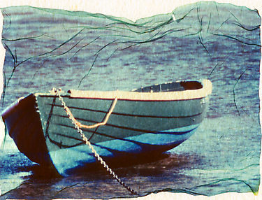
 Positive Polaroid lift offs work best when a photograph has good lighting and a subject that isn't too dark. If I was taking a photograph to be used for a polariod liftoff I would make sure it had colors that would transfer well. I would also make sure I read my light meter accurately so the image doesnt develop dark. I would use simple subjects such as landscapes with a subject. I like my polaroid transfers because the subects are simple, a flower and trinket. The colors in the photo and the lighting turned out really well.


Portrait Photographers

Steve McCurry
I like this photo because of the intense detail and emotion. I like how the miners eyes have alot of power. I also like that the photographer captured the smoke in the photo.

Cecil Beaton
I like this photo because of the photographic elements used. Leading lines and the rule of thirds are utilized in this picture. I also like how the color of the model's dress was strategically picked.

Annie Leibowitz
I really like this photo because of the motion captured in the teacups and the emotion captured in the subjects eyes. I also like how the photographer used layering to add an extra aspect to the photo. The fact that the models are well known faces also adds an extra flare.

Norman Parkinson
This photo adds an old time fashion appeal. I like it because of the background and the use of framing. The cars in the back were captured around the model without intersecting her. The tree in the foreground also frames the model.

Richard Avedon
I love this photo because of all of the motion captured. The photo is very simple yet it has plenty of appeal because of the dress' movement and the side lighting.

Tuesday, November 29, 2011

Sepia Tone

A good sepia print consists of a subject that will contrast well in brown tones. These examples of sepia toning are good examples because each photo has a simple subecjt it is focused on. They also have subjects that have alot of neutral colors brough out by sepia toning. I like my sepia print of the china cabinet better than the photo of the flower. This is because the china cabinet has more browns that were brought out by the processing.


Wednesday, October 19, 2011

Hand Coloring

A good hand coloring print includes a subject with lots of detail. This type of photograph is also shot in low light, this prevents coloring from being blown out. In my prints I used objects that consisted of color. One was a place setting, and the other was a vase with grapes. I like my hand coloring of the place setting because the simplicity makes the photo look better. It was also easier to color because if the simple lines. I didn't like my other hand coloring photo because the different shape made it difficult to color. I also don't like the color I picked for the background.


Cross Processing

Cross processing is when you develop one type of film in a different chemical than it was intended for. In order to make a good cross processing print you need to make sure the background doesnt have alot of elements. You also need to make sure your light meter is correct. I wanted to use simple objects in my cross processing prints. I used a pumpkin and a tractor. I did achieve what I wanted in my prints. My colors have a little orange tint. I liked the backgrounds of both of my prints as well.


Tuesday, October 18, 2011

Solarization

In order to create a good solarized print I would start with a subject that will have alot of contrast. Good subject would include any metals with alot of light reflecting off of them. It would be good to keep the photograph as simple as possible because some things solarized might distract the viewer from the subject.

I really like my solarized pictures. One was of a locker with a hand going to unlock it. The nailpolish on the subects hand made for a good contrast, as well as the metals in the lock. My other print was of a car. I also like it because of how the contrast changes as light hits different parts of the car.

Examples:


Layering

These photos are all have examples of layers in photography. This assignment makes me a better photographer because it makes me think of how I can add an extra layer to make a picture better. I like my layers photograph of the football game. It was alot easer to incorporate many different layers with people constantly moving.


This photo not only has layers but it utilizes framing as well. The bride and groom's glasses frame the toasters body. There are three layers in this photo. The bride and groom, their glasses, and the man giving the toast. The far background could also be considered a layer.


 This photo has many layers. There is the women, the subect, who has been doged. Then there are men watching from the left as well as the furniture adding more layers.


This photo has 4 to 5 layers. The first is the man and woman sleeping on the bench. The man behind them adds another layer, as well as the men along the wall. The women on the far bench also add another layer.


 In this photo the man is accompanied by three other layers. There is the table before the man, the man, and the obect behind him. The back wall adds anther layer as well.

Tuesday, October 4, 2011

Polaroid Transfers

Polaroid Transfers look best with simple subjects and backgrounds. All of the examples I found had one focus. My polaroid transfers also had very simple subjects. One was of a little metal trinket, the other was of flowers. My colors transferred well becuase my slides were not too dark.

This polaroid transfer has one subject, the church. I think this transfer is very good. The photographer utilized rules of thirds. They also kept the background very simple.
This polaroid transfer is also appealing. It is very simple, yet it still has substance. I particularly like the Golden Gate Bridge in the background. This is also a good transfer because there is very little lift off.


This polaroid transfer captures a cab in a city. The photo is simple and also utilizes motion blur.


I really like this polaroid transfer because it is simple yet appealing. I like how the lines of the house or shed fall behind the bike. I also like how the colors transferred.

Wednesday, September 28, 2011

3200 Film

These photos are both examples of 3200 film. I chose these photos because not only do they utilize the 3200 film, they are also interesting. I can use these techniques in future photos because they demonstrate layers as well as framing. I like the way the grain looks in these photos. They add an extra piece to the photographs. I was only happy with one of my 3200 film photos. I liked my picture of the wheel because the grain added more detail to the wheel treads. My other 3200 film speed had bad lighting. If I shot another 3200 film photo I would make sure I was shooting in well lit areas. Some disadvantages of this film tyoe is the loss of detail depending on the grain size.


First Roll Reflection

My first roll was taken at school. I took photos of flowers, people, as well as the scenery. I liked this roll because there were many subjects that could be manipulated. The first two photographs I printed were of Emily. One was of her feet perched on a railing. Another was a portrait of her with trees in the background. Compositionally, I could have added more layers in each photo. Printing wise I could have done more dodging and burning to bring out the subject in the feet picture.

Thursday, June 2, 2011

Portrait Critique

I think my portrait photo is alright. If I could change anything I would straighten the horizon lines and make sure they didnt intersect the head. I would also burn in more around the subject.

Portraits

I was attracted to this portrait because of the angles it was shot at. I also like how the eyes are a focus in the photo.

This photo makes an interesting portrait because the bride's face isnt seen. There is also dramatic lighting and framing from the window.

This portrait is intersting because it shows the man doing his job. I like how the photographer made sure he was the focus in the photo, and there weren't alot of distractions.

This portrait is intereeesting because it shows the man's personality. His eyes show alot of emotion.

This portrait of the little boy is appealing because it is light and fun. The boy is showing his own creativty. Lines are also used to draw your eyes to the boy.

I like this portrait because it shows the ruggedness of the subject. I like how the lines and wrinkles in his face are well defined as well as the lightining that makes him pop.

This portrait is interesting because it uses lighting and short depth of field as well as an interesting subject that makes the photograph.

This photo is interesting because it breaks the rule of thirds. It works though because the photo is virtually symmetrical.

This is an intersting portrait because it uses the rain as an added element. I like how the person's identity is a mystrey.

This is an interesting portrait because it shows the subject's personality. I like it because of the hands in the photo.